


welcome to my headspace
opening up those studio doors for next week

Read At Your Leisure
If you are on social, you might have already happened upon the new video series I am sharing this week leading up to the Drop. I am pretty excited about it. I love a storyline. I love connecting with all of you. Hearing how you relate and what you enjoy. I think it’s helpful to hear me talk about the work and the process of it’s becoming too.
But if we are being real, half of you don’t have your sound turned on. SMH. So dropping this script here for an easily digestable morning read. Read at your leisure. And let me know what you think. Heads up. It’s long. But worth it.
Diving On In
It’s nothing new that I love a good title. Something a little cheeky. A little splashy. A good window into the work but I want to really bring it on home for us. And hopefully give you a little space to interpret it for yourself ;) So let’s start from the top.
NOTE : if you want more details on other pieces - go watch the videos on Instagram. My fingers get tired of typing. I’m better at blabbing.
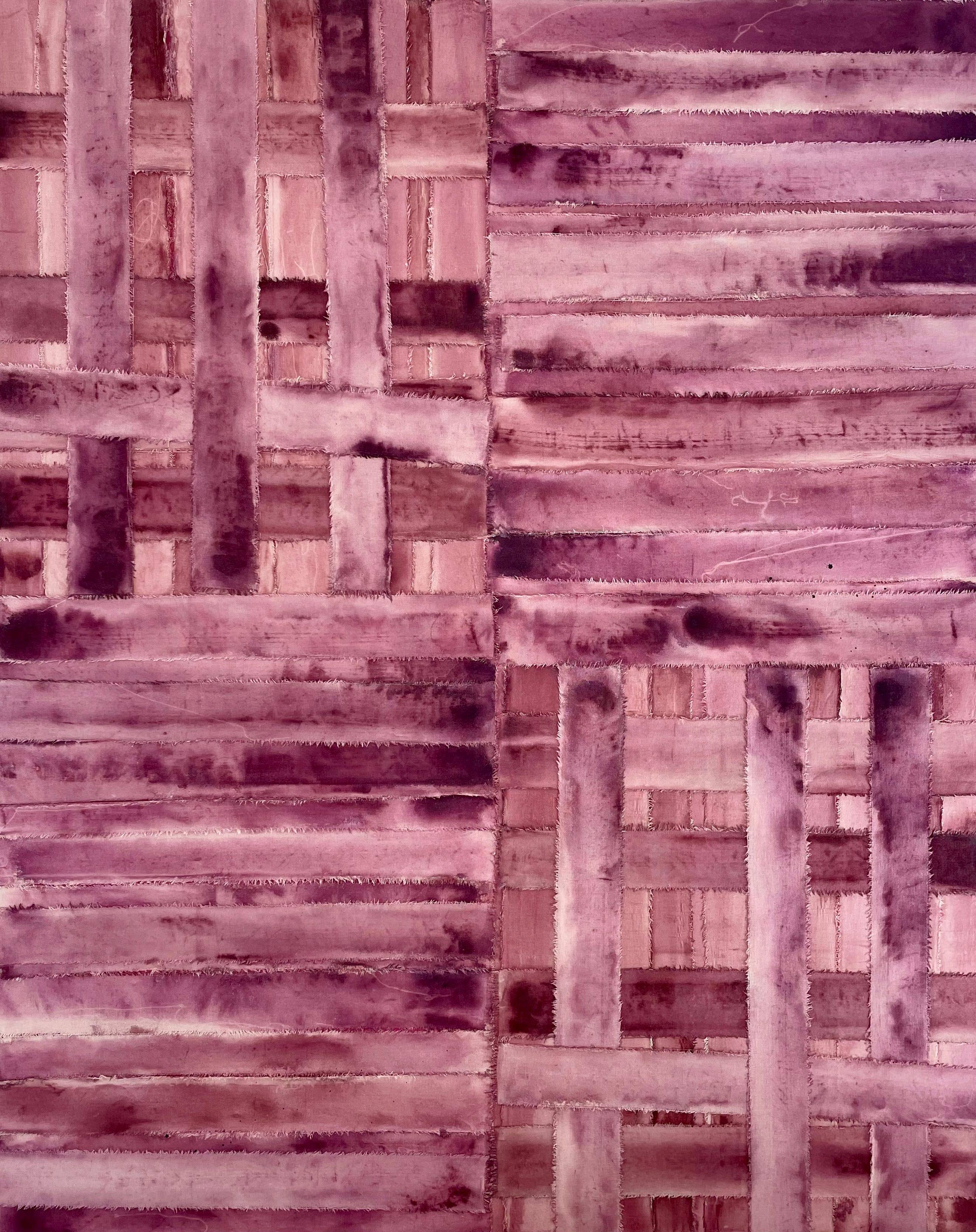
All Bent Out of Shape
This one. This was the third canvas work I completed. After I finished Luckie Charm I created a mustardy yellow painting which mimicked the composition of LC. It didn't feel right. It felt too safe. It felt repetitive. And stiff. So when I saw the vertical orientation of the beginnings of All Bent Out of Shape I knew this would challenge me to pause and rethink.
The composition came to me one morning when thinking of the quadrant play in my work. Which is seen in the tapping off in paper works. How quadrants are important in the textile/screenprinting process. How it’s intended to disguise a repeat. This work pushes against that. It pushes the repeat on you.
I loved how the center line where the quadrants meet was “off kilter”. It was not perfect. It had depth and you could see where the strips were layered. I loved that. I started thinking of how we all try to appear like we have it all together. That all our lines are “straight” and our I’s are dotted.. I wanted to push against that.
To challenge the viewer to try to find a straight line.
How there is beauty there.
Then the woven component then came into play. This really brought it home for me. Not every quadrant needed it. It would then be too stimulating to the eye. If you look closely you'll see two different shades of purple/magenta being explored. One more canceled (having more yellow) and one more saturated. This push and pull I think made the tension of the work even more interesting. If I had to keep one… it would be her. She is so yummy.
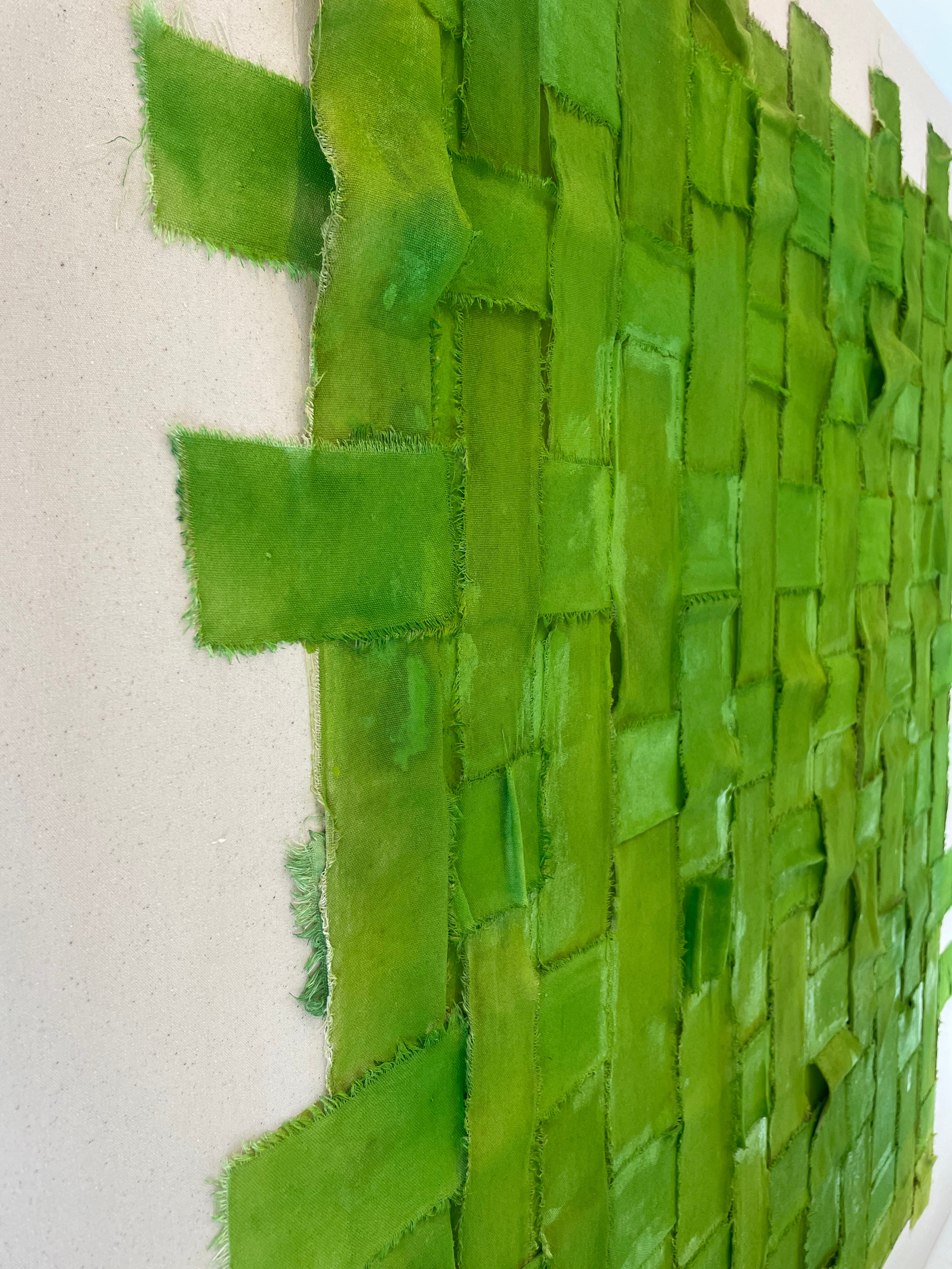
Put Me in a Box
At this point in the creating process I started to see my common theme. What they felt like and what the titles were leaning into. Most artists might know what they are trying to “say” before they begin but for me it is almost always revealed in the middle. Sometimes even after. Which I like.
Put Me in a Box came to me after I had finished Go Home and Change. I found the weaving and the breathing room really had something going for it. The negative space almost made it stronger. I knew there needed to be one canvas work that nodded to my previous work. So that the raw, unprimed canvas could be shown in all its glory.
Oftentimes a canvas of this size can be intimidating. The best thing for me to do is place it on the floor and mess it up. I mapped out my square and tapped it off. I took spray paint and went to town. I actually enjoyed how this looked as is. I was very tempted to leave it there but it wasn't expressing fully what I was going for so I bookmarked it. It can be something I explore later.
I started ripping and dying my strips. I played with placing them inside of the box. Once adhered it just didn't feel right. The strips were not really extending beyond the square. They were playing it safely within the square. There wasn't enough interplay with the negative space. And the color of the strips just didn't feel finished. There wasn't enough tension. I was enjoying more of the brightness of the spray paint in the background popping through in between the strips.
At this point we needed to have this photographed so the catalog could go to print. So I thought ok either I pull this or I go for it. I went for it. I went in and extended the edges and added movements. Then I taped her off one more time and brought the spray paint to the foreground. And that did it. It felt complete and accomplished what I was wanting it to say. This piece was meant to be interacted with. You need to see it from all angles. It also feels gutsy with the intensity of the palette but is offset with the surrounding neutralizing background.
Go Home and Change
This one was a surprising favorite. I had intended to adhere the strips flat but when I was in the process of placing them this airiness and breathing room in between the woven strips happened. It was stunning. I tried to maintain that appearance while safely adhering to make sure it would keep its shape. I played and pasted. Once I felt like everything was as I wanted it to be, I placed it upright. It was phenomenal. From the front. From the side. The space around. The colors being subtle yet present. It is just good. This one was a star at the preview party in NYC. I love the conversation with the canvas being on the paper too. The varying weights.
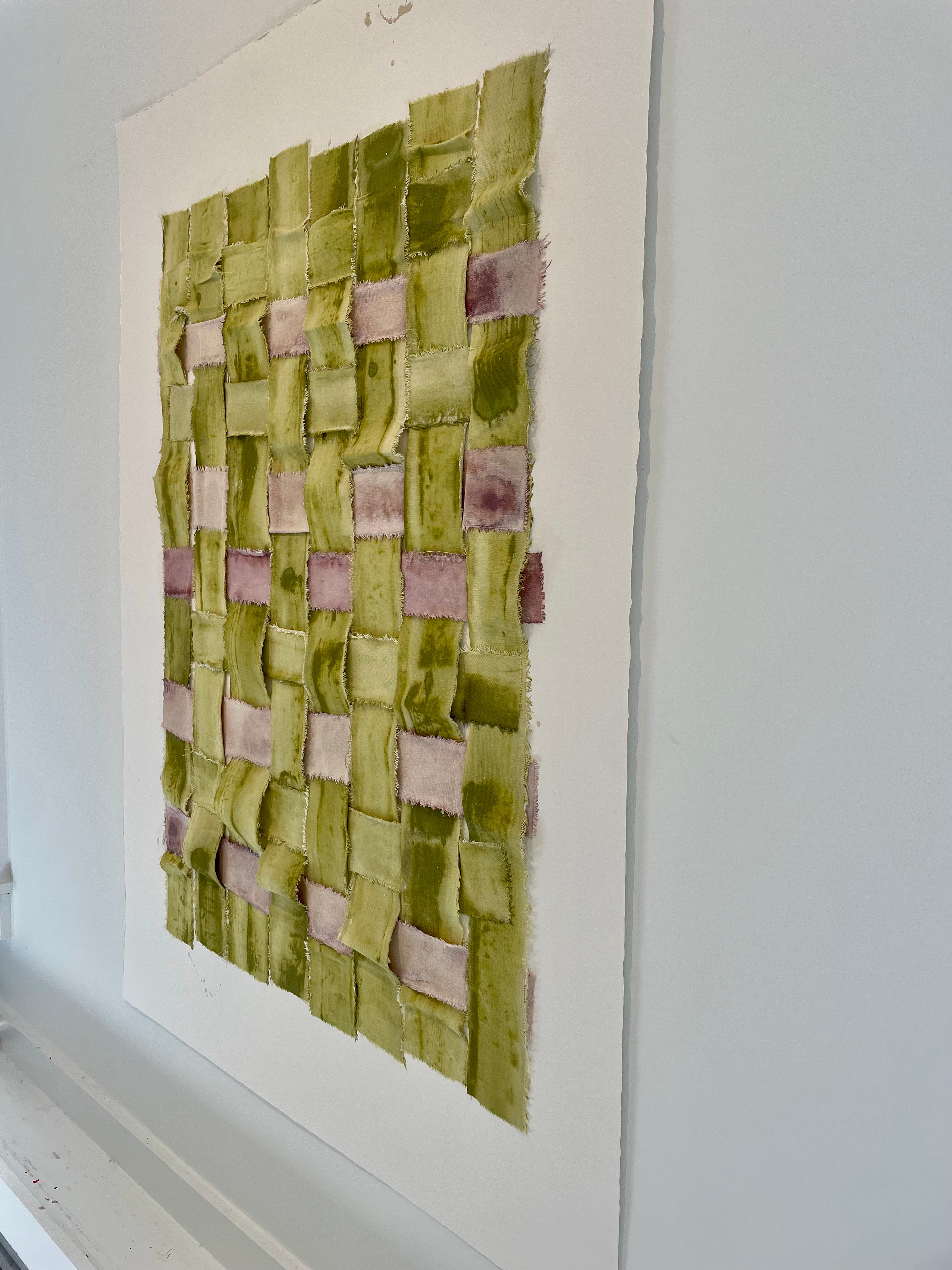
Works on Paper
The best way to view these is to think of them as deconstructing the textile design process. I am turning it on its head. Playing with moving beyond the grid. The taping off. The fluid background. The textile strips that add that “ick” and the textural component. How the paint seeps into the fibers. The overlay which is made with a squeegee (textile tool). How that feels milky. Almost like ice cream with a surprising bite. It is all the good combinations. The vertical orientation is to be read like a portrait. Each having its own individual personality and perspective. These are my ride or dies. They are my language.
Wrapping It Up
I hope this has helped in understanding the pieces a little more. These will “drop” on my website next Wednesday, October 18th at 10am CT. I am sharing an index beforehand. This will show you the works that will become available and provide pricing/sizing. If you’d like to receive this please email me - laura@lauradeems.com :))
xLDJ